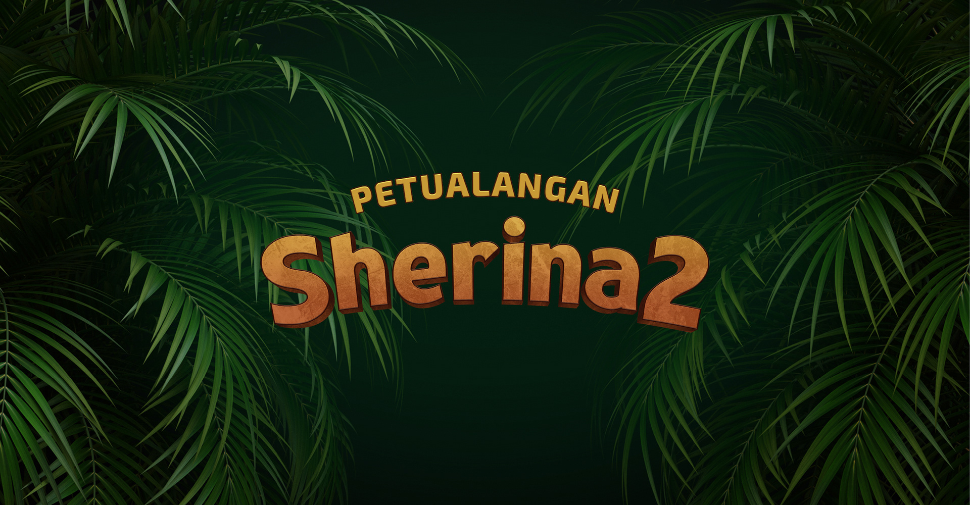
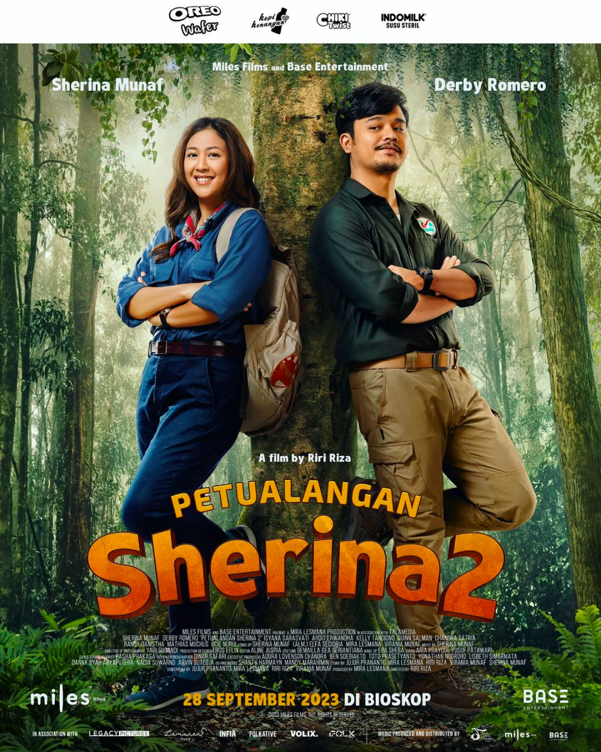
Petualangan Sherina 2 Identity & Typeface Design
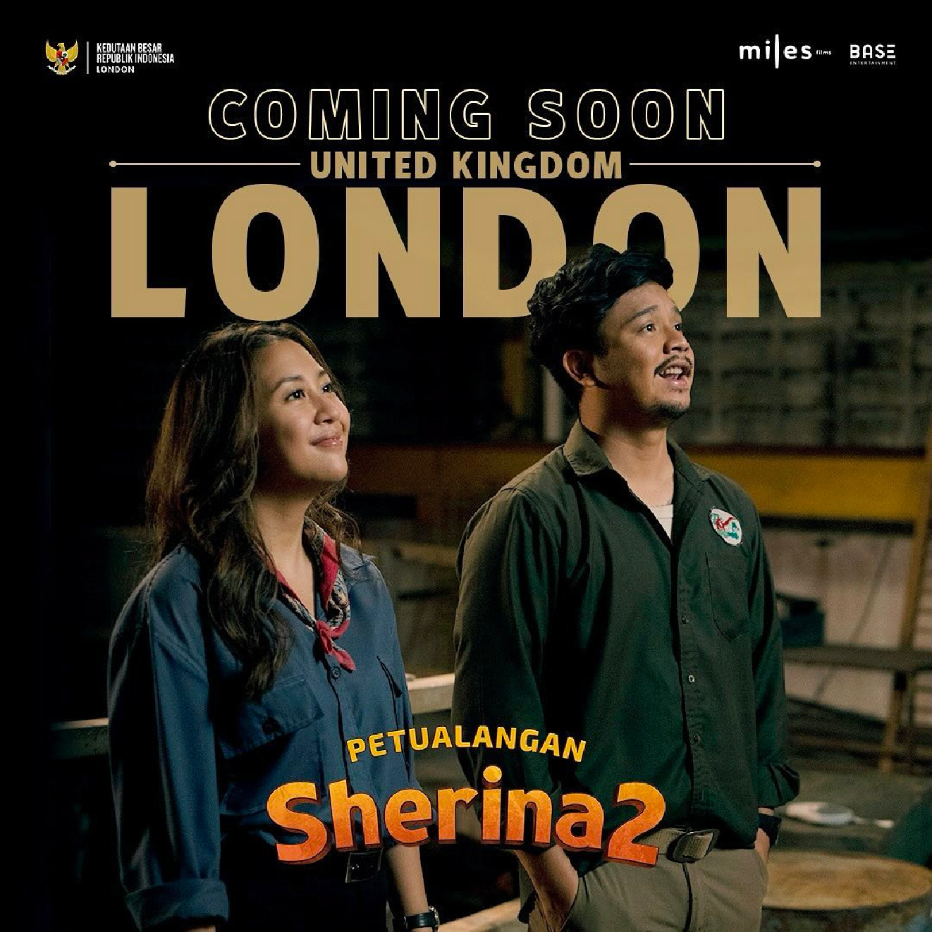
Petualangan Sherina 2 is the long-awaited sequel to one of Indonesia’s most iconic musical adventure films. For this project, I was entrusted with designing the logo identity and custom typeface, aiming to bridge the youthful spirit of the original with the matured, cinematic tone of the sequel.
The result is a visual identity that feels nostalgic yet contemporary, reflecting the evolution of Sherina’s journey from childhood to adulthood.
The result is a visual identity that feels nostalgic yet contemporary, reflecting the evolution of Sherina’s journey from childhood to adulthood.
The logo direction for Petualangan Sherina 2 draws strong visual inspiration from the original 2000 film. The goal was to create a sense of continuity and nostalgia, while evolving the design to feel bolder, more refined, and suitable for a cinematic comeback. We retained the core charm of the original logotype, a playful, rounded letterforms with a handcrafted feel, but reworked it into a custom typeface with more weight and presence, ensuring better legibility and impact across modern media formats.
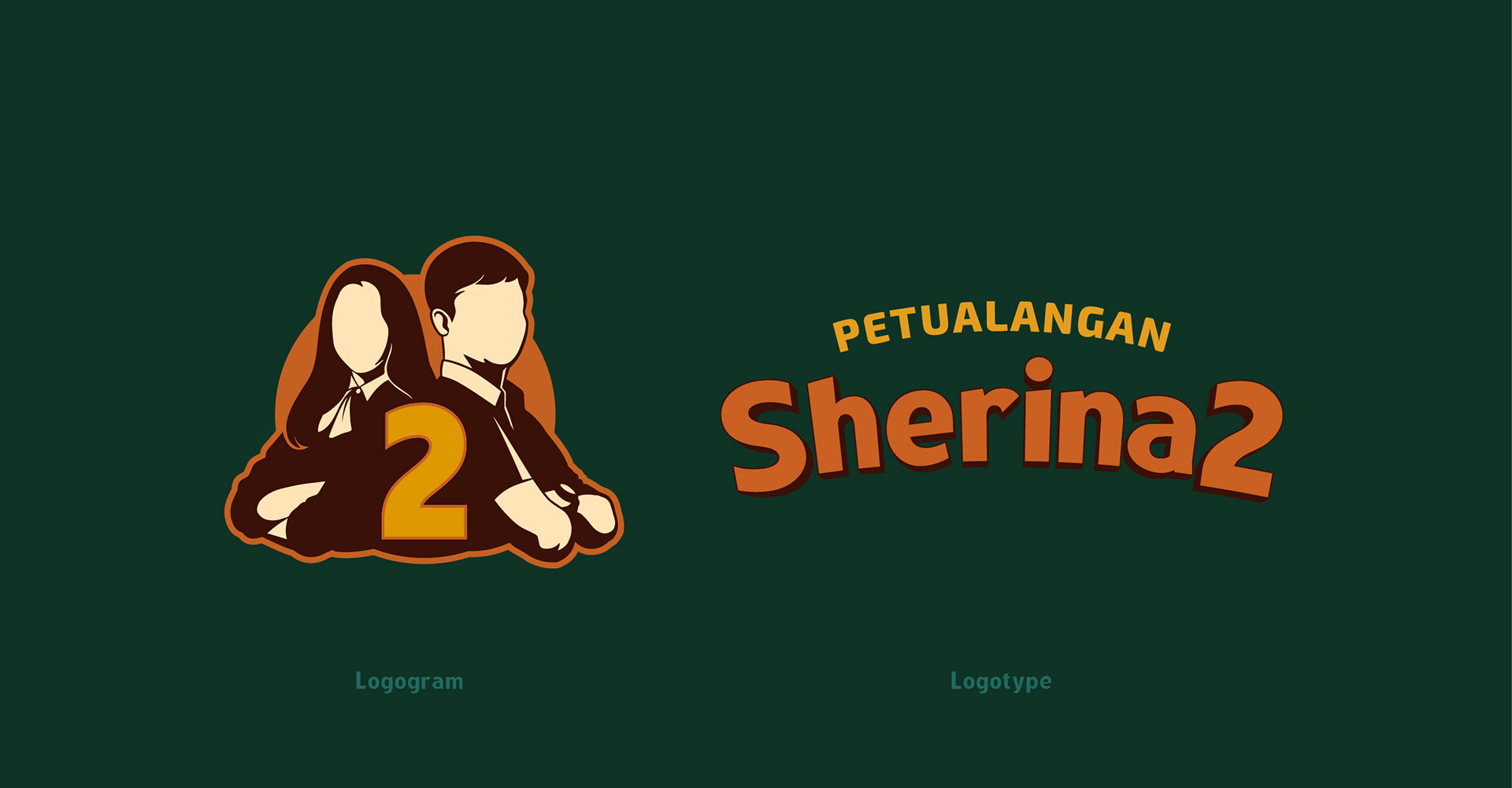
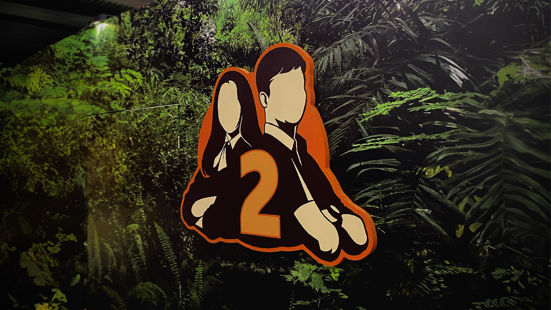
A key visual element is the iconic pose of Sherina and Sadam, which we reimagined as a silhouette-style logogram. This simplified yet instantly recognizable figure serves as a tribute to the duo’s legendary friendship and evokes a sense of familiarity for audiences who grew up with the first film. The overall color palette and composition are designed to feel warm and adventurous, setting the tone for a story that bridges childhood memories with new experiences.
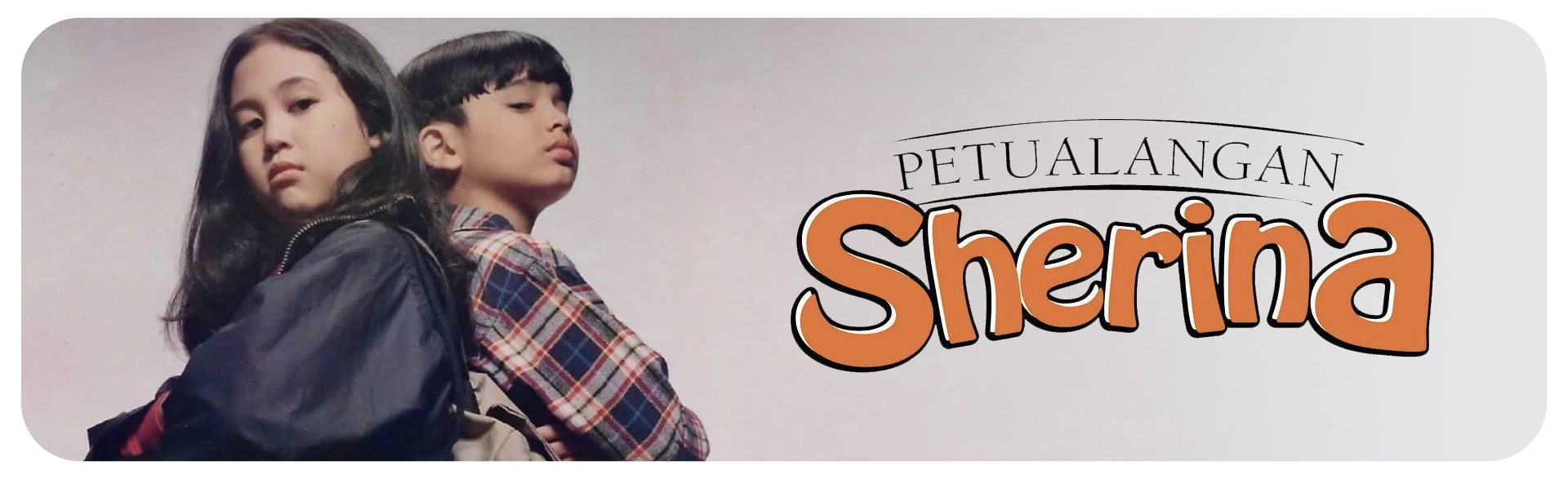
Iconic Pose of Sherina and Sadam, and Petualangan Sherina (2000) Logo
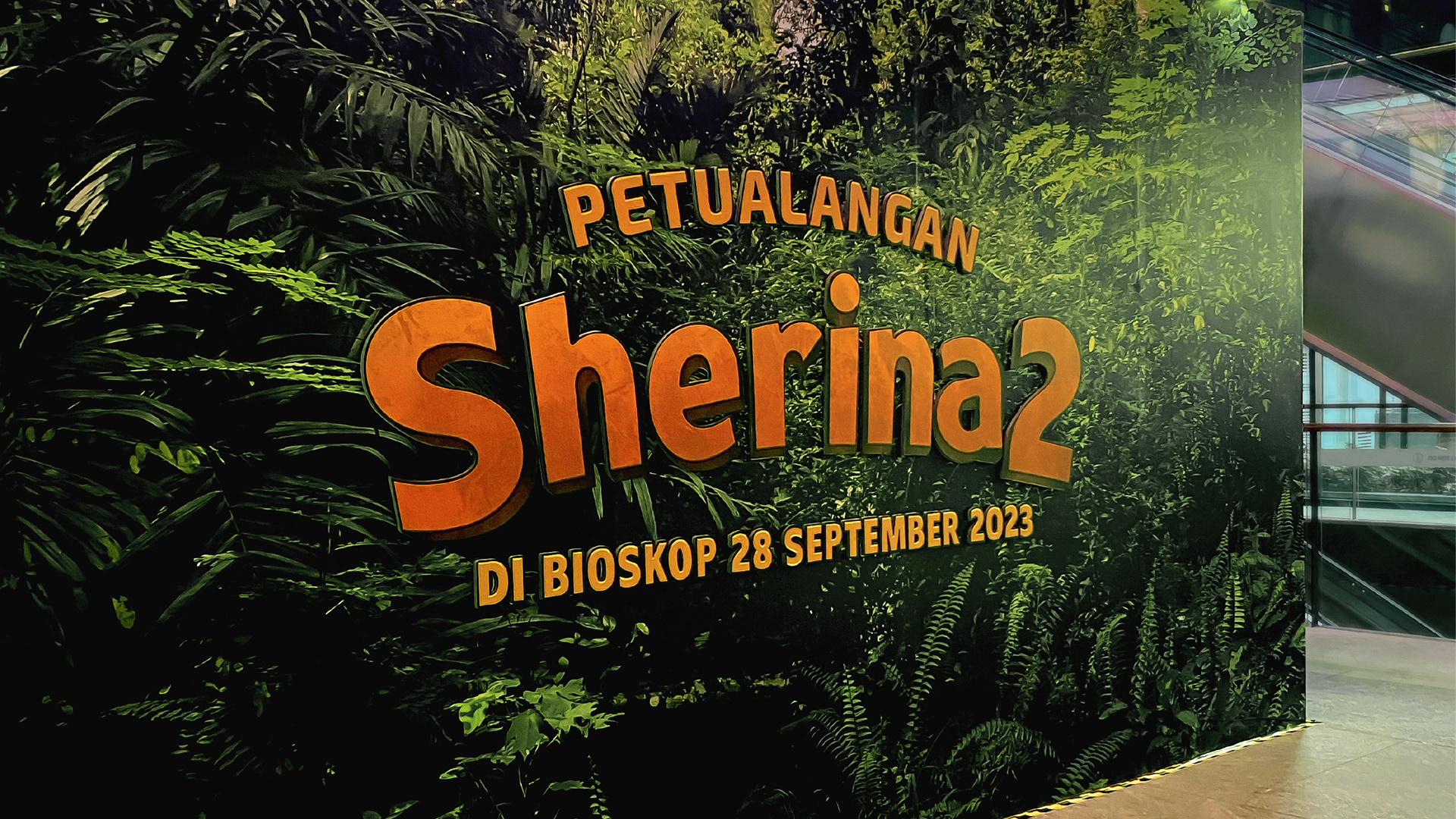
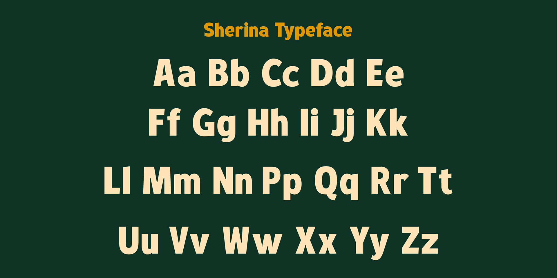
A custom display typeface was created to complement the logo and enhance the film’s overall branding.
It carries playful, humanistic traits with slight retro touches—carefully fine-tuned to feel both familiar and fresh.
It carries playful, humanistic traits with slight retro touches—carefully fine-tuned to feel both familiar and fresh.


Creative & Poster Designer: Alvin Hariz
Photographer: Noor Aldy & Yus Prinandy
Script Highlight: Stephany Josephine
Stylist: Ray Hafidz
Title Logo & Typeface: Muhammad Faisal
Sketch/Storyboard: Kakafauzi
Skin & Cropping: Rianto
Crew Photo: Azies
Photographer: Noor Aldy & Yus Prinandy
Script Highlight: Stephany Josephine
Stylist: Ray Hafidz
Title Logo & Typeface: Muhammad Faisal
Sketch/Storyboard: Kakafauzi
Skin & Cropping: Rianto
Crew Photo: Azies